
Superflux // in-flux
Concept Dev / Motion Design
Animations based on the stellar label designs from the fine folks at Superflux Beer.
I've been a huge fan of Vancouver-based craft brewery Superflux for many years. In addition to making stellar beverages, they have a distinct and bold design aesthetic in both their branding and can labels.
Many of their labels seem to have an inherent sense of movement and flow. From time to time, when I've found myself with a bit of extra time on my hands, I like to see what happens if I make the awesome designs they created dance a little.
Montserrat
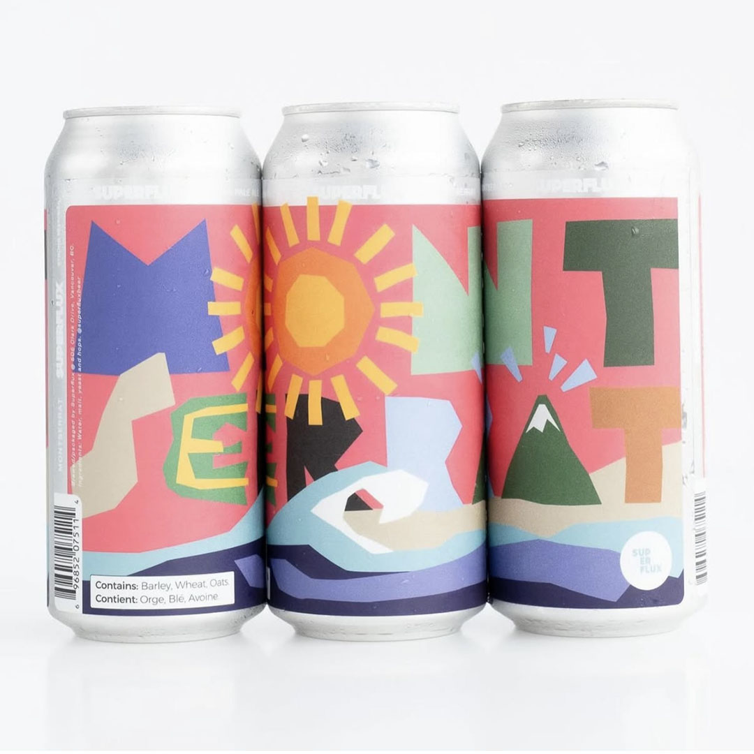
Photo credit: © Superflux Beer
The charming, almost construction paper-style look of this label felt like it would work well with a classic stop-motion style approach. I recall Superflux describing the name choice as being inspired by the Alps, a Spanish region, and the typeface all of the same name. With that in mind, I figured a jaunty Spanish tune would make a good pairing.
Velvetone
As mentioned, I'm a big fan of the beer Superflux makes, but my standout favorite over the years has been the Velvetone. A double-IPA that balances out strong flavour without tasting overly boozy. The label always gave me very strong moody space vibes, so some slightly ethereal electronic ambient felt like the right fit for its musical accompaniment.
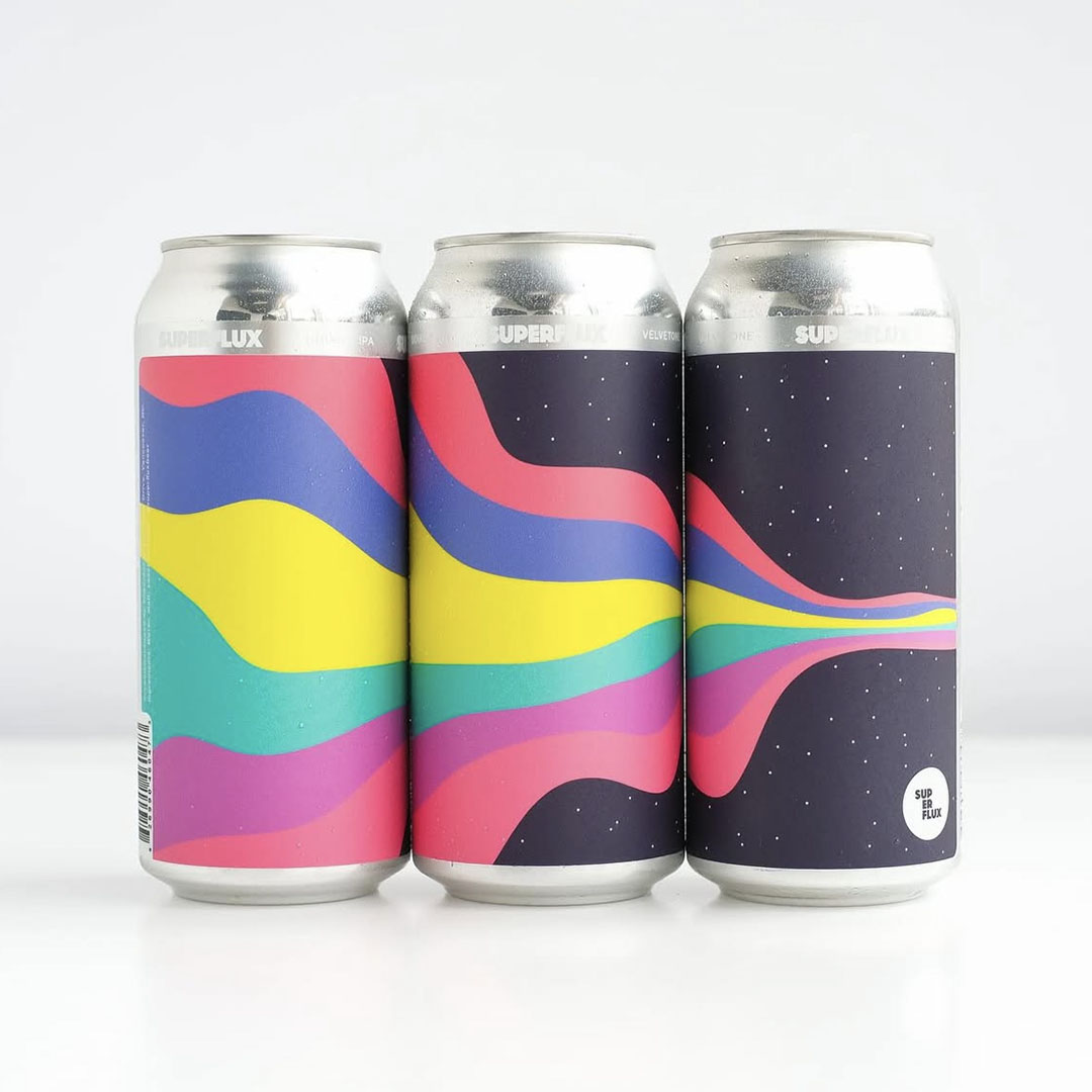
Photo credit: © Superflux Beer
Dreamwave
Photo credit: © Superflux Beer
The design of this can has some definite hints at an 80s Memphis style, so a little bit of synth pop would likely have fit well here. The animation's flowing, vaguely psychadelic central element didn't quite jive with the pop though, so I landed on something with a bit darker Carpenter-esque moody synth.
Pug
Ah, pugs. There are few things more adorable than these ridiculous little pups. Wanted this one to feel a little on the silly side, so I chose some music to match. And even managed to find some actual pug grumbles.
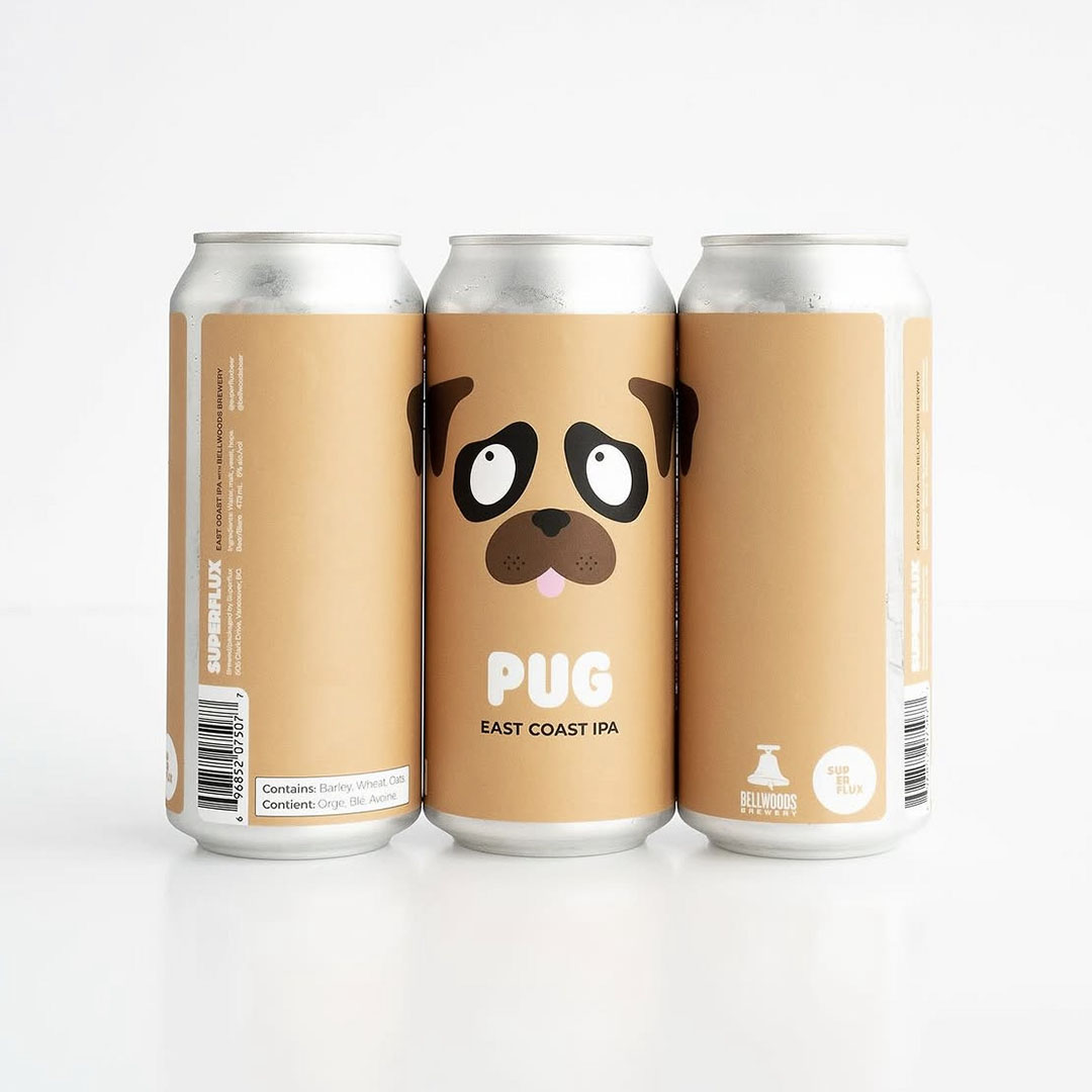
Photo credit: © Superflux Beer
Mesa
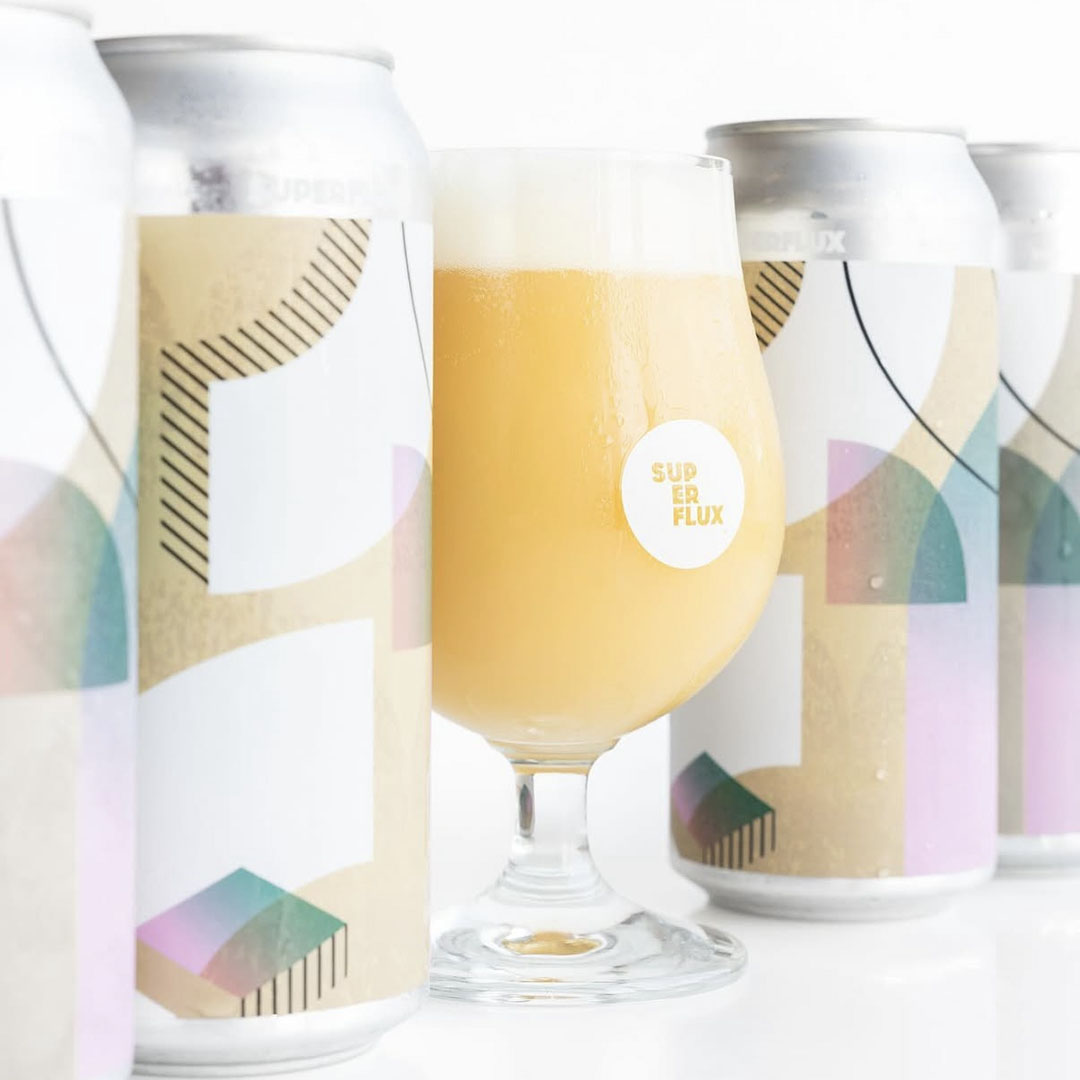
Photo credit: © Superflux Beer
Design-wise, it feels like the label was definitely leaning into the Memphis vibes, albeit with a more tasteful and restrained color palette. In building out the animation, I was aiming for a bit of a "structured chaos" approach, giving everything its own thing to do, while hopefully avoiding becoming just a jumble of motion.
Pretty Much Yeah
Colors! Patterns! Words! It's always impressive to me when designs can have this much going on, and still feel cohesive. If I had a bit more time to devote to this little side-project, next step would be timing out the animation a bit more to the slightly funk-inspired background track.
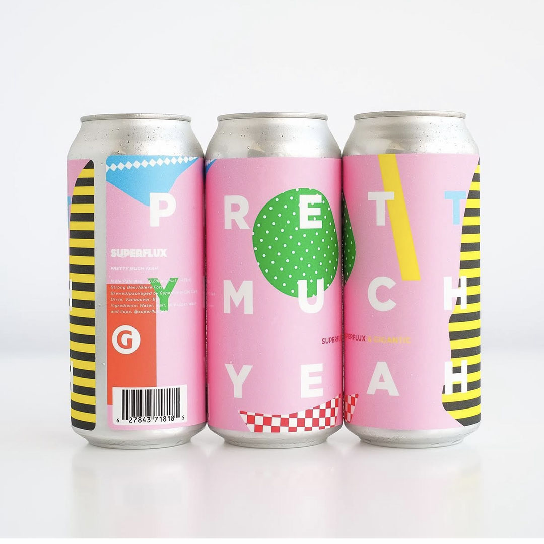
Photo credit: © Superflux Beer
Honeydrop
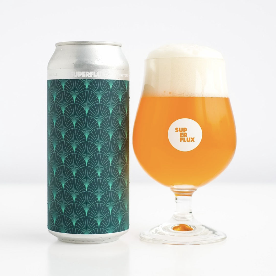
Photo credit: © Superflux Beer
This was one of the early experiments, so I kept it pretty simple. The art-deco adjacent style seemed like a good fit with a bit of a classy background track.
Wonderlove
Punchy! Funky! Nuff said.
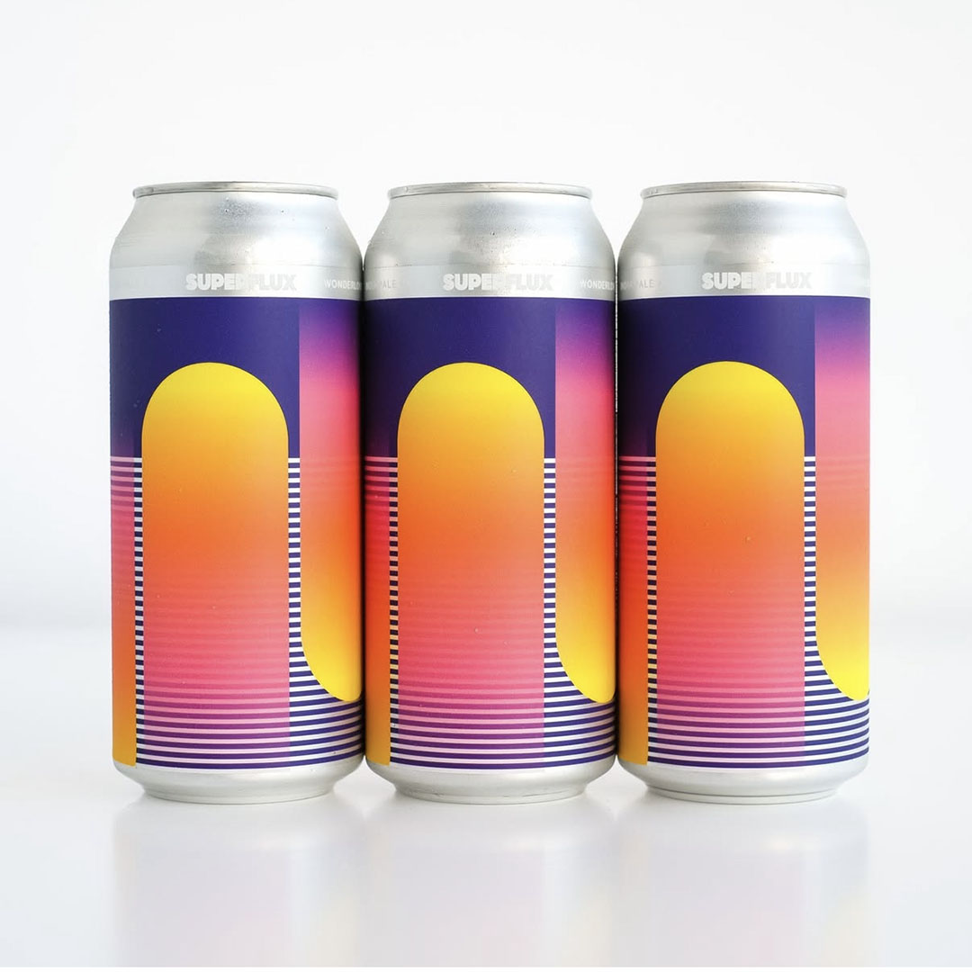
Photo credit: © Superflux Beer
Airstream
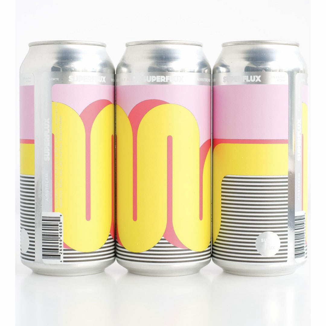
Photo credit: © Superflux Beer
The very first label I animated. I recall looking at it and noticing the distinct flow that the design had, and that's when the notion of making it move for real popped up. Luckily I saved the label in my sketchbook, because I didn't actually get around to making it for about a year or so.
Say hello!
Email: creative@markstokoe.ca
LinkedIn: markstokoe
© Mark Stokoe Creative 2025